

Why Props Matter in Professional Food Photography
Props Aren’t Decoration — They’re Strategy
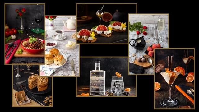
When people think of food photography, they usually think about the food itself. But look closer at almost any professional image and you’ll notice the quiet details around it — the board, the glass, the napkin, the flowers, even the crumbs.
Those props aren’t just decoration. They’re doing a job.
Here are some of the roles they play:
- Adding context and mood — the base and backdrop used in a shot can hint at the style of the venue: homely, rustic, sophisticated or trendy. Props can also add mood — roses suggest romance and sharing, for example.
- Highlighting ingredients — the inclusion of ingredients says a dish was crafted on the premises, not pre-made by a supplier, and can let the viewer know what flavours to expect.
- Suggesting premium quality — linen napkins can say a venue is a proper, classy restaurant, not a pop-in café.
- Complementing colours — the colours of napkins can complement elements of the dish, and even suggest the heritage of the dish (e.g. the Italian flag in a pasta shot).
- Leading the eye — angled cutlery or a folded napkin can act as arrows, guiding attention to the hero of the shot, or helping guide the viewer’s eye around different elements.
- Creating scale — including familiar items can anchor scale; using smaller plates and cutlery can even make things appear larger than they are.
- Building brand identity — branded glassware (as in our Withers Gin shot) is the obvious one, but sometimes it’s about echoing colours, textures or feature items from a restaurant’s décor.
Why this matters
We read props subconsciously. They change how we perceive value, quality, and atmosphere. A plastic fork makes a dish feel cheap. A linen napkin makes it feel refined. Even the way a crumb is left on a board suggests whether a shot feels rustic or polished.
The risk of getting it wrong
Overdo it, and props clutter the frame. Use them inconsistently, and your images feel disjointed. Props are there to support the hero dish — never to compete with it.
Worth knowing
When you invest in photography, you’re not just paying for lighting and lenses. You’re paying for the quiet decisions about props, context, and consistency that make your food look like it belongs to your brand. Done well, those details are almost invisible — but they make all the difference.
Also…
Want a chance to win a free shoot? Sign up to our newsletter and stay in the draw every month you’re subscribed.
Curious what stronger images could add to your sales? Try our ROI calculator.
Loved this food photography?


